
CLIENT
SERVICES
Website
Visual Identity
PROJECT CHALLENGE
The challenge Stocks Ahoy put to us was to create a brand style & website that had a youthful feel, that connected like-minded individuals to each other & stock market information, as well as to steer away from the industry standard of bland styling and confusing layouts of information.
SECTOR
Stock Markets, News
CLIENT
Stocks Ahoy is a stock market news & interaction platform that was disgruntled with the state of the industry’s lack of community & easy to take in information. Which now has a vast amount of accounts taking in the latest information & interacting about the latest market ongoings.
WHAT HAPPENED NEXT
The first thing to do was work with Stocks Ahoy to get a deep grasp on what exactly were the pain points & things not to like about others operating within the space. We found out that this was clunky designs, stacked information in small areas not leaving your eyes to pass through content naturally, no community base, & an array of colours/ongoings.
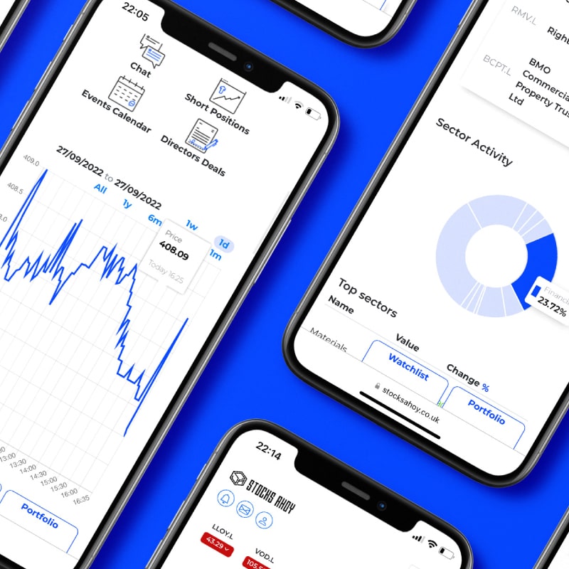
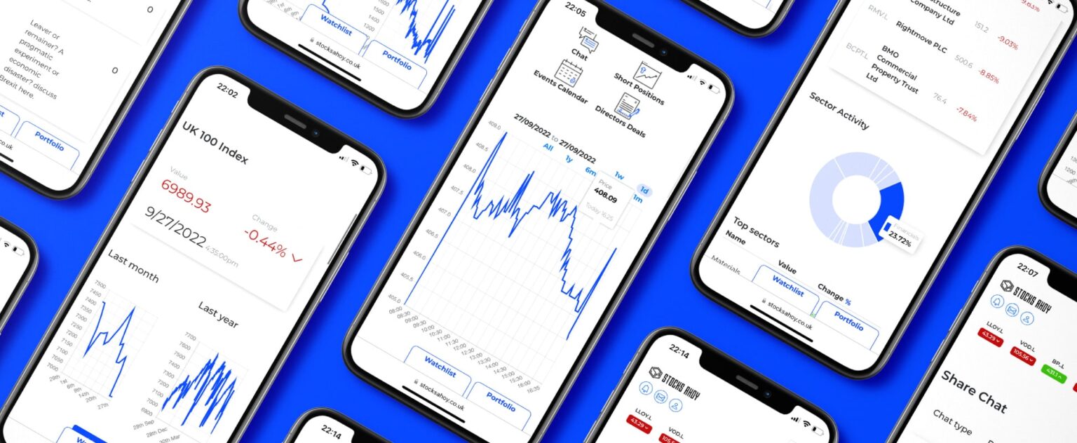
Keeping this information at the forefront of our minds we constructed a brand identity that is clean clear & minimal throughout the brand. The blues give off a trustworthy & confident feel while being able to draw attention when used as points of interest. The website has been designed to allow users to pass through the site and take in information easily without being overwhelmed by side panels & alternative articles. The user chat and interaction areas create a community feel throughout.


THE OUTCOME
Stocks Ahoy now have a user-friendly website & visual identity to allow newcomers to not be overwhelmed & feel part of something.
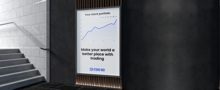
Our work with Stocks Ahoy has made them a breath of fresh air amongst over-cluttered, hard-to-navigate, impersonal competitors. They are now a go-to for all who wish to be in the know of the stock market world. A clear stand out within their competitive industry with a logo system that works alongside their to-the-point website, eye-catching ad designs, their growing community & interaction they will only go from strength to strength.
WORDS FROM CLIENT
“We come to Hunter Studio because wanted a particular style, one that was far more refined from the current work within the Stocks industry, & a style that would connect to more youthful audiences coming into the industry. We now have a brand style that our previous & new users are connecting with, it’s engaging in every sense. ”
LEE DOBSON
Co Founder of Stocks Ahoy


LET’S MAKE YOU OUR NEXT BIG PROJECT LIKE THIS,
ALL WE NEED TO DO IS GET IT STARTED!
